Key Takeaways:
– Weather forecasting directly deals with the uncertain, but this isn’t always conveyed or immediately clear when it comes to dealing with hurricanes and major storms.
– Since hurricanes and major storms are dangerous and multifaceted, adequate warnings have to reflect all aspects of the storm. Even a category one hurricane can be devastating, partly due to storm surges that can cause as much or more damage as the hurricane force itself, but are often not as widely feared. Care must be taken by the media to convey the risk of storm surge as separate from the hurricane.
– Since the process of reacting to a warning is more complicated than just hearing a warning (and involves being credible, believable, and personal) the media portrayal matters immensely. Subtle and seemingly inconsequential changes can affect the validity of a warning or report.
– Picture images that show the storm have a greater of effect on people than any graphic in demonstrating danger and risk.
– All weather graphics rely on the same data and science, they just differ in how the information is visualized or level or detail. As this a is a tough task, often graphics can be obtuse and therefore serve as poor warnings. Weather communicators have to balance this in creating graphics.
Even if we’re not from a hurricane hotbed, we’ve all the seen the news reports. The impending hurricane is given a graphic treatment, usually as a red stylized icon on a path with some time stamps. These can be as simple as overlays on a map, or fancy expensive stylized graphics. This is usually accompanied by warnings and a somber report from a weather man. To the majority that are unaffected, this is just the news. But to those who might be in the path of the hurricane, it matters what is said and shown. Do we have to evacuate? Do we have to plan for an emergency? Everything said and presented has an effect, often times unintended.
Gina Eosco, of the Cornell University RiskComm group, studies these effects. Eosco, who labels the goal of meteorology, “saving lives and protecting property,” researches how these messages are received. The graphics on the news can affect people in ways that are not immediately obvious.
The best example is the so called cone of uncertainty. Or cone
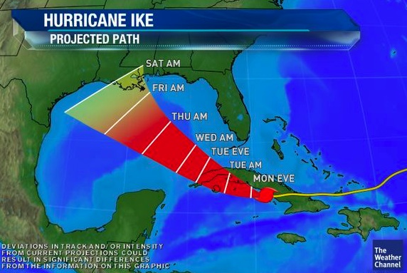
A typical cone of uncertainty
of doom, or even cone of death. Whatever you want to call it, it’s staple of hurricane and storm surge coverage. It’s just a graphic representing where the most likely path of the hurricane, based on the government’s models.
Every year brings a new series of graphics and ways of representing the forecast. These changes can affect how people react, even if they’re subtle. Weather graphics and forecasts deals with uncertainty all the time, as the term forecasting implies uncertain. Yet this message of “we can’t always be right because its impossible” isn’t always received. And this can lead to people tuning out and ignoring the warnings, even when it may endanger them. (Some people have a proclivity for evacuating no matter what and that is a problem as well, although a smaller one).
The best way of summing up the difficulty in representing weather might be to draw rain. Try it – I’ll wait. What did you come up with? Maybe some slightly slanted vertical lines, or some oblong pointed droplets. Or maybe to make your intention clearly you drew a rain cloud as well. Now would anyone actually think looks like rain if you just polled them on the streets? Probably not. So this is what the weather media is up against each team there’s a major storm – how to convey the danger (or lack thereof) in a meaningful and impactful way.
Everyone gets their weather from the same source, whether they are aware of it or not – the government. Weather.gov has all the information you could need, provided you know where to click and how to use the information. So that’s really all the media does – interprets the same government data and visualizes it for the publics. But this is important – that means everyone graphic you see across the networks and media in general has the same data. Everyone is just representing the same data. So each source tries to make the data salient and real – often with foreboding colors and warnings. Yet using the wrong color or map can screw it all up. This is why this a multitude of “bad” graphics – not because they have bad info but because they convey message poorly. Maybe the legend is complicated or missing, or maybe the meaning just isn’t clear.

Another flavor of cone
The severity weather is hard to convey quickly, especially with the uncertainty involved in the forecast and the response of people. Hurricane Irene, which was relatively mild in the New York and Tristate area despite the forecasts only because its path was a few miles off kilter – a tiny meteorological mistake that had huge ramifications. So when Hurricane Sandy and its storm surge brought similar threatening yet still uncertain forecasts (as all are), the message was tuned out to an extent. This led to Sandy being the disaster that it was, despite the warnings.
Hurricanes are not just complicated to predict, they have complex effects. Much of the damage from Hurricane Sandy was due to its storm surge, the fast moving water displaced by a hurricane itself that lands onshore. Because of this, storm surge is no longer linked to a hurricane’s category ranking. They’ve been decoupled in an attempt to avoid confusion. If a hurricane has the most mild rating – category one, its winds alone might not scare people to evacuate. But the accompanying storm surge could cause massive water damage. The storm surge surge is what flooded the New York subway system and caused water damage throughout the city that is now forever linked to Sandy.
Eosco and RiskComm investigated how people respond to these weather reports on the news. These reports are always changing, sometimes haphazardly. Graphics and colors change, but the data doesn’t. Most cones of uncertainty, a representation of where they eye of the storm is, fail to reflect there’s a one third chance it *won’t* be there. Changing colors can change the way a message is perceived. Blue can be less threatening than red, but in some graphics blue coloring may represent flooding risk. The people who design and air the graphics don’t study the effect of colors. And again, these graphics change a lot. Yes they’re accompanied by a voice over explaining what it all means, but its not the voiceover that is shared on twitter. Social media means its all interwoven, and the pictures that litter a repot become the whole report in a new context.
Some trends become clear from the research, which consisting of examining how people react to these warnings in real time. No matter how hard we try, it seems real pictures of weather are much more threatening and less uncertain than the graphics that forebode them. These non-photos just don’t seem as salient, and don’t have the same effect on viewers. Thats also why early pictures of storms and funnel clouds are so important, and important that they’re accurate and reported correctly. This is also underlines the importance of effective producing weather graphics.
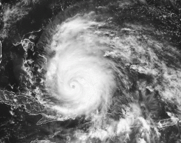
Just no cone is as threatening as the real thing
It’s also not enough to just report a potential danger or risk. The warning process isn’t that simple. First one has to receive a warning – which they must both understand and believe. Once its believed it also has to confirmed (again, why the pictures and first hand accounts are so important). It helps if the message is also personalized is some way – think those weathermen you see on the news bracing the conditions for the sake of it. Only after meeting all this criteria, does one decide to react to a warning. This is just the process to get someone to decide – and that decision is heavily affected by media portrayal of the weather.
So every hurricane cycle, the graphics change in an attempt to better the coverage. The first warnings in the early 2000s look archaic by today’s standards. As the techniques for forecasting get better and the cones of uncertainty get smaller, the graphics will be improved in larger part due to current research, as past research findings become current policy and practice.